UX Lead
1 Researcher
3 UX Designers
- 1.7 Billion weekly views
- CSAT: Increased satisfaction by +20% to 74%
- DSAT: Decreased dissatisfaction by 7% to 12%
- Defined UX strategy for PDF improvements
- Secured buy-in to establish information architecture framework across all files types
- Set high-level design direction, collaborated with UXD/VisD
- Delivered 6 major features
- Designing 6 additional features for future milestones
Context
Improving PDF consumption became a core pillar of Drive's 2025 strategy, with a focus on delivering a first-class experience. The goal was to make Drive the platform of choice for PDF workflows—eliminating the need for third-party tools and enabling users to work more efficiently within a single ecosystem.
While Workspace is best known for its native Editors, user behavior told a different story:
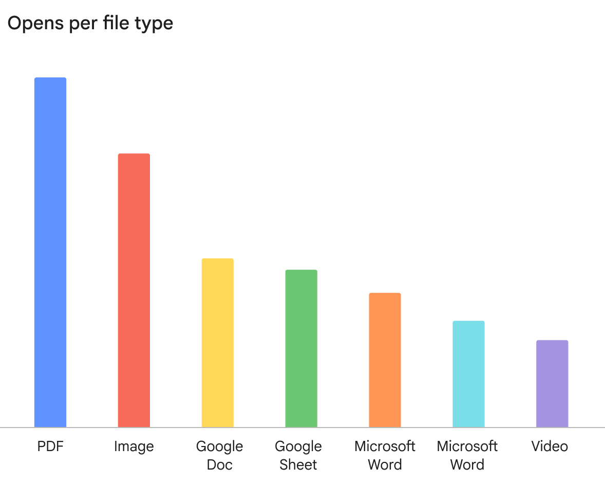
- PDFs are the #1 consumed file type in Workspace
- 1.7B weekly views across Drive
- 46% of all viewed files are PDFs
These insights reframed PDFs from a simple viewing problem into a high-impact productivity opportunity at massive scale.
Opens per file type
Despite their importance, the PDF experience had remained largely unchanged for years.
- Users frequently had to leave Drive to fill forms, annotate, or edit PDFs
- Navigating complex documents was inefficient
- Fragmented workflows created friction and exposed competitive gaps with specialized tools
Led a one-year modernization roadmap focused on closing the competitive gap and elevating the PDF experience across:
- Viewing improvements
- Form filling
- Editing and annotation
- Navigation and document structure (e.g., tables of contents)
This work redefined PDFs from static files into interactive, intelligent content experiences.
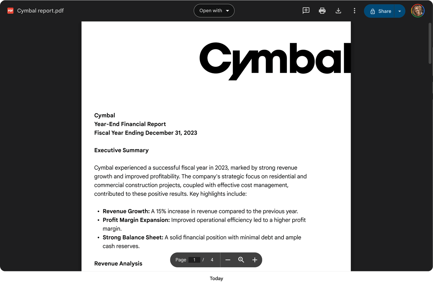
Today
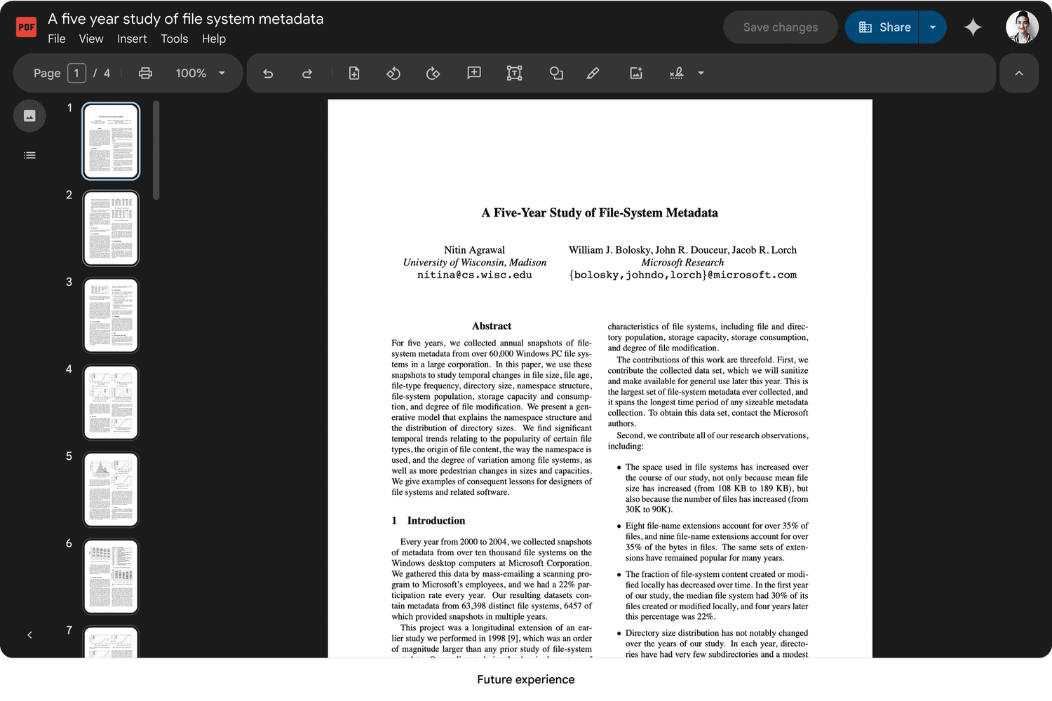
Future experience
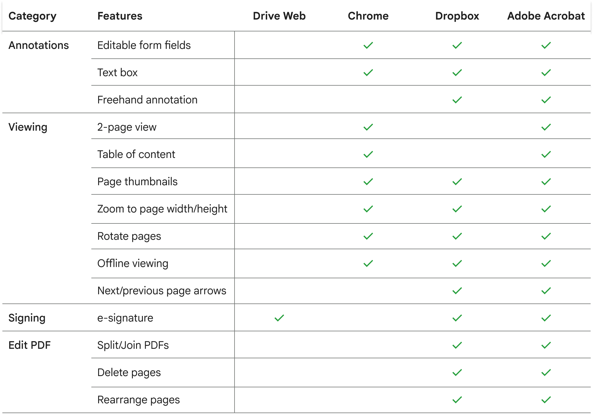
Competitive Audit
Drive is missing table-stake features compared to competitors.
Design Process
My approach had two parts:
- Information architecture
- Table stake features
Information Architecture
To accommodate a rapidly expanding roadmap, I designed a scalable information architecture framework. This system ensured that new features could be integrated seamlessly without disrupting the core user experience as the product evolved.
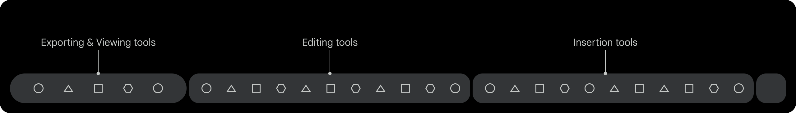
Defined taxonomy into categories and insert tools with a team card-sorting exercise.
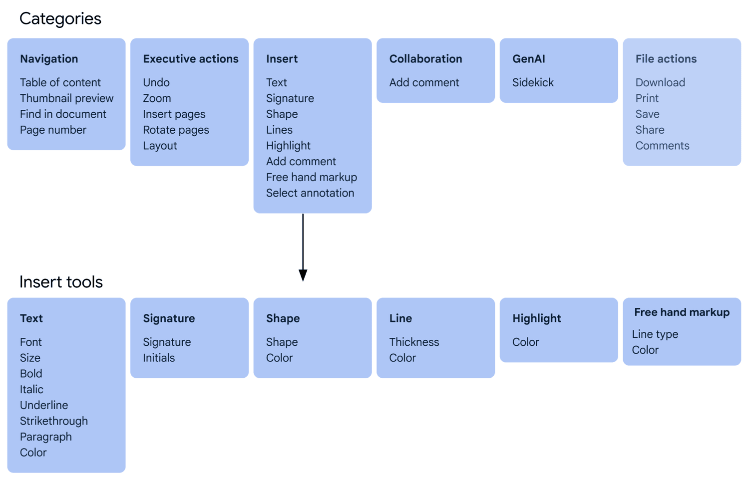
Leveraging Workspace precedents for navigation and collaboration; focusing design optimization strictly on viewing and markup toolbar positioning.
I organized an information architecture alignment session with the Google Slides team, who were also updating their IA, to define a unified Workspace strategy. We explored two directions:
- Align with Editors to ensure cross-product consistency (Moved forward with this direction)
- Create a new system for third-party files using modern Google Material 3 patterns
While I felt the Editor toolbar was dense and dated, leadership chose alignment with Editors for cross-product consistency.
Option 1 - Align with Editors
Option 2 - Create a new system
Defined Principles
Established guiding principles to inform product decisions, align cross-functional teams, and ensure consistency across the experience. These principles created a shared framework for evaluating tradeoffs, prioritizing features, and maintaining a cohesive user experience as the product evolved.
Scalable
A flexible system that scales across other Drive Viewing file types and won't break with new features
Progressive
Reveal options as the user dives deeper into workflows
Contextual
Lean on AI to provide contextual nudges that allow the user to shortcut cumbersome tasks
Familiar
It feels like an Editor so I don't have to think or relearn new patterns
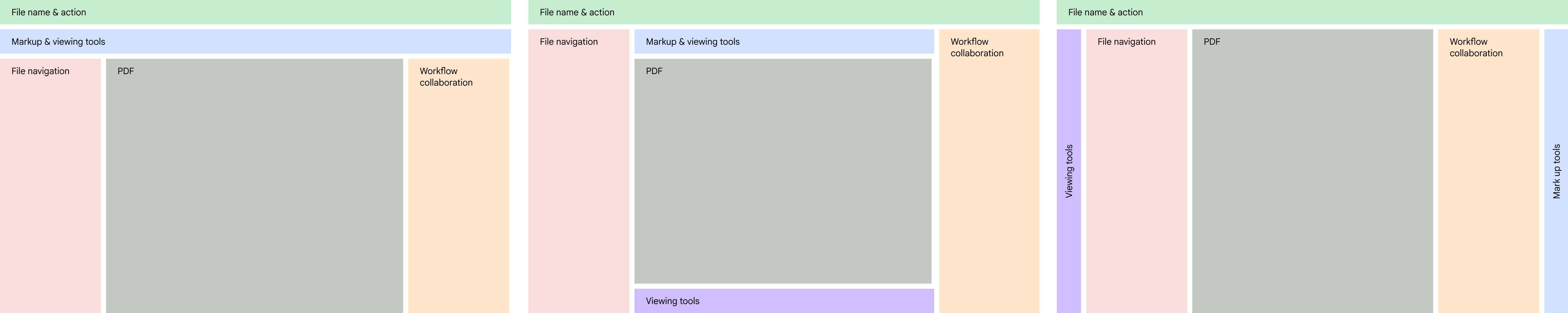
Unified Navigation System
Major advocacy win: While designing the PDF experience, I recognized it would feel fragmented if other third-party file types lacked consistent navigation, especially as users cycle between files in the viewer. I defined a strategy to unify navigation across all file types in File Viewer, standardizing menus and toolbars into a scalable system rather than solving PDFs in isolation.
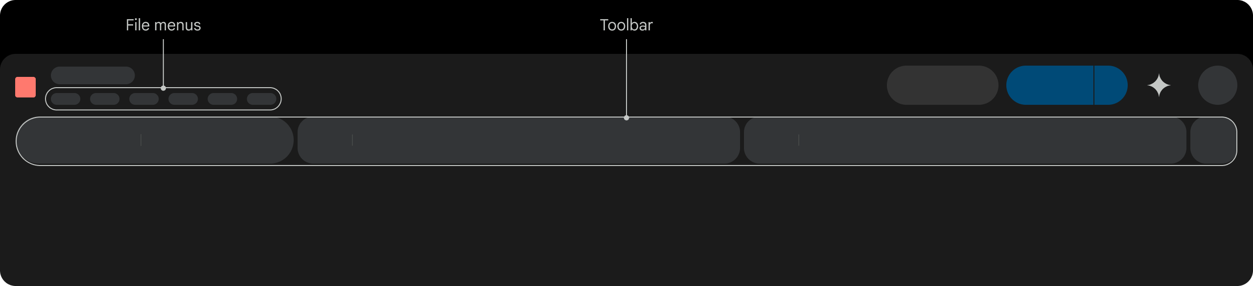
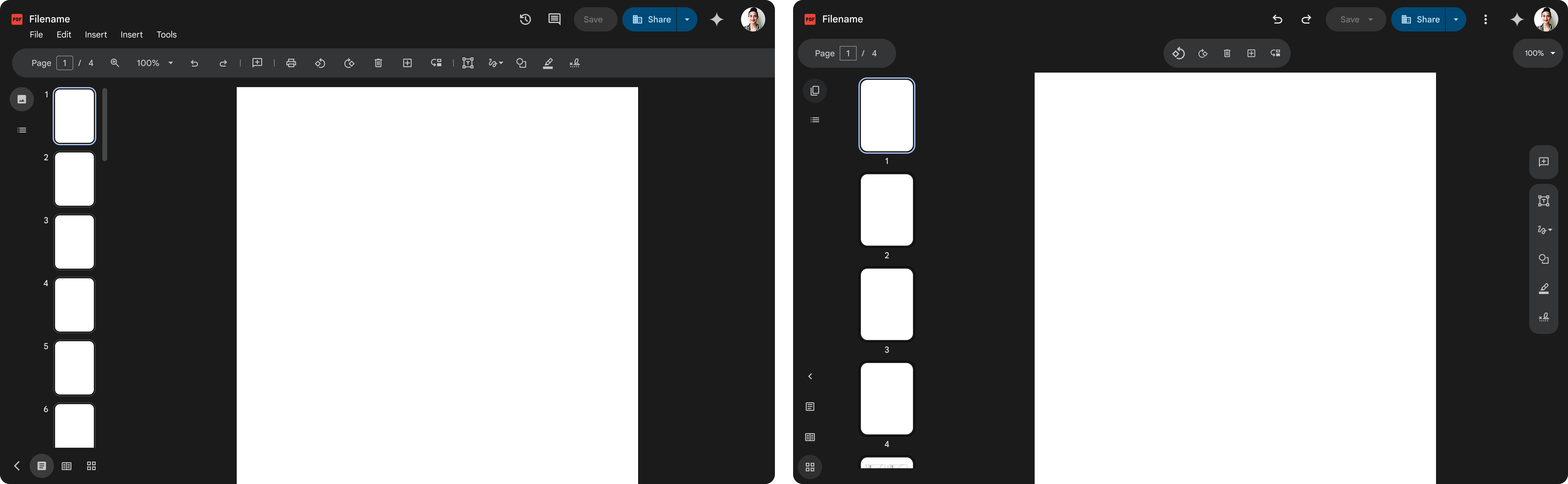
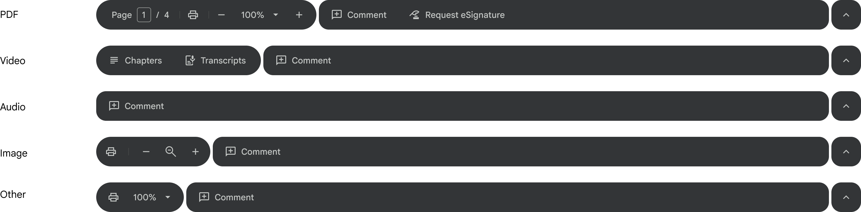
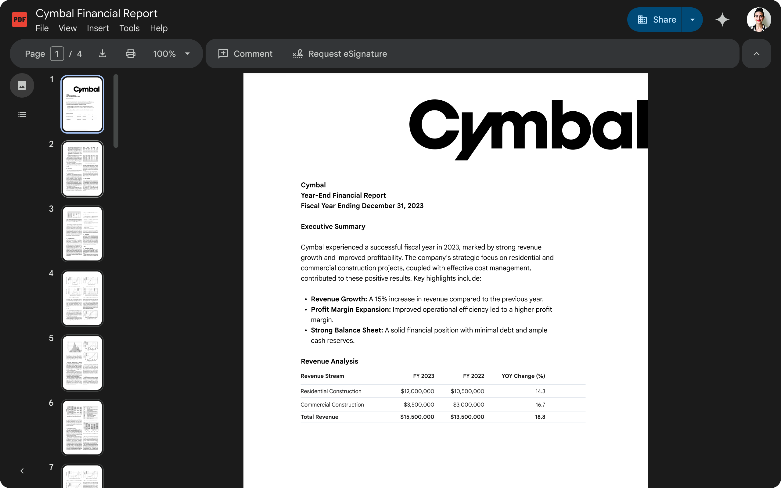
Toolbar
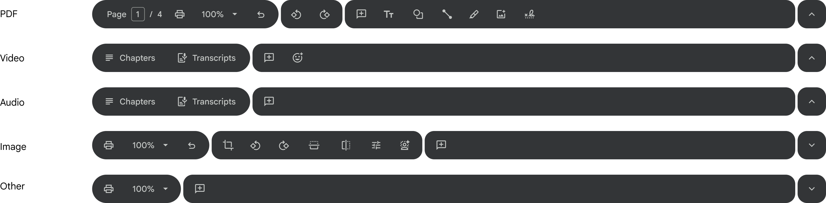
While building on the Editors toolbar pattern, I evolved it to align with Google Material 3's updated shape and toolbar guidelines, improving visual clarity and scannability. Partnering with Video and eSignature UX leads, I also drove design convergence across tools into a standardized system aligned with the Workspace design system and familiar user mental models.
Short-term toolbar
Long-term toolbar
In context

File Menus
- Actions aren't easily discoverable
- Missing features, like Make a copy
- Menus inconsistent across Overlay and Standalone file viewer
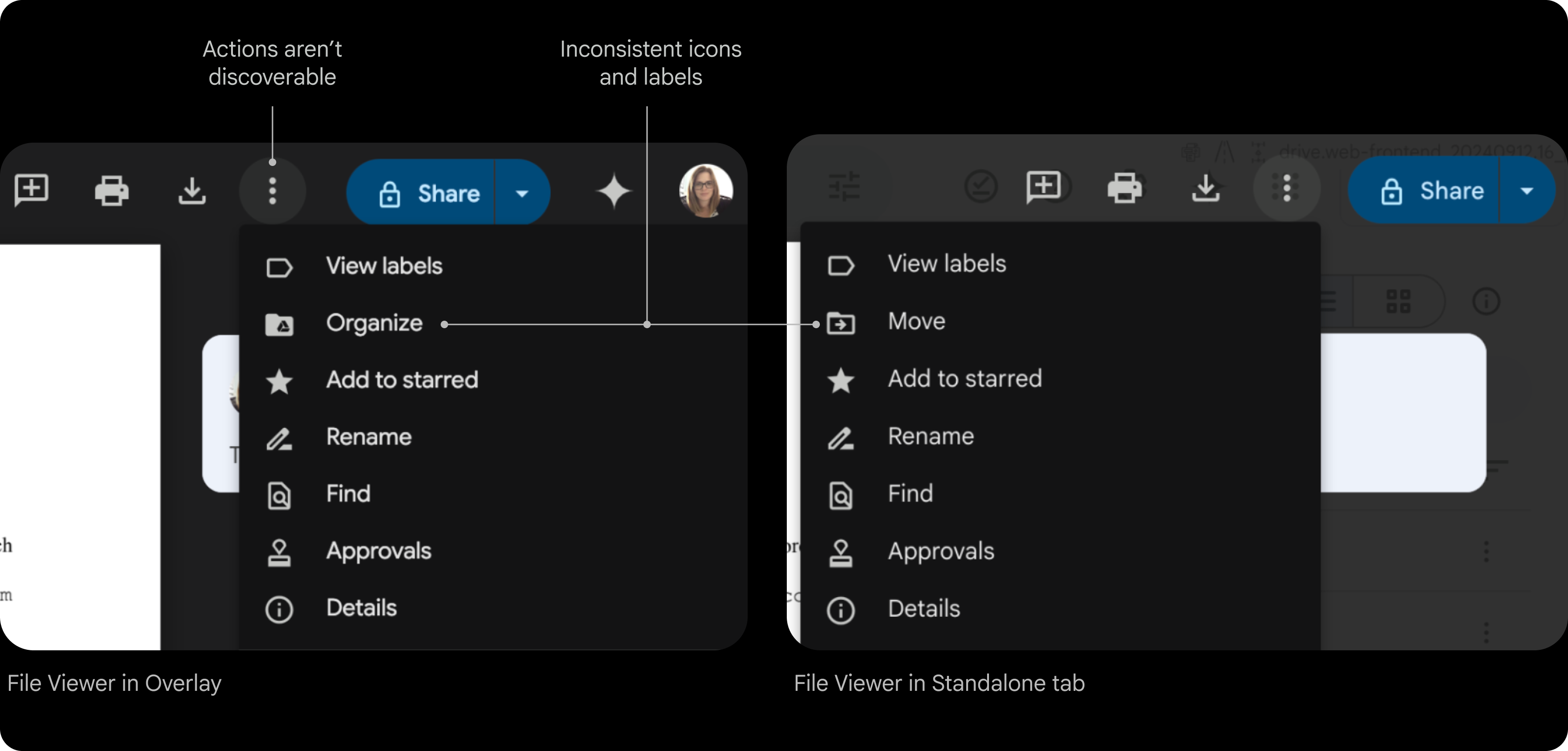
Conducted a comprehensive audit of the File menu to identify inconsistencies across surfaces and file types, then established a unified taxonomy aligned with Editors — standardizing groupings, iconography, and keyboard shortcuts for a more predictable experience.
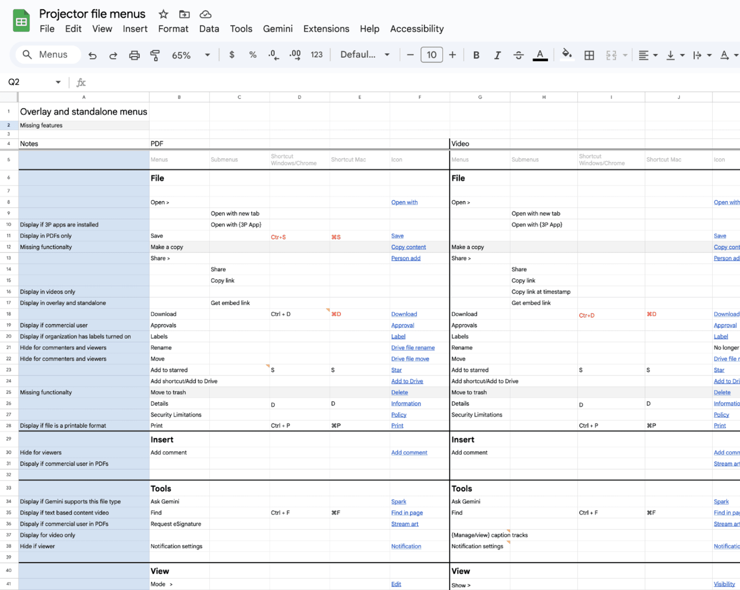
The Editors recently updated their file menus. To keep navigation familiar we aligned with their IA, language, and icons
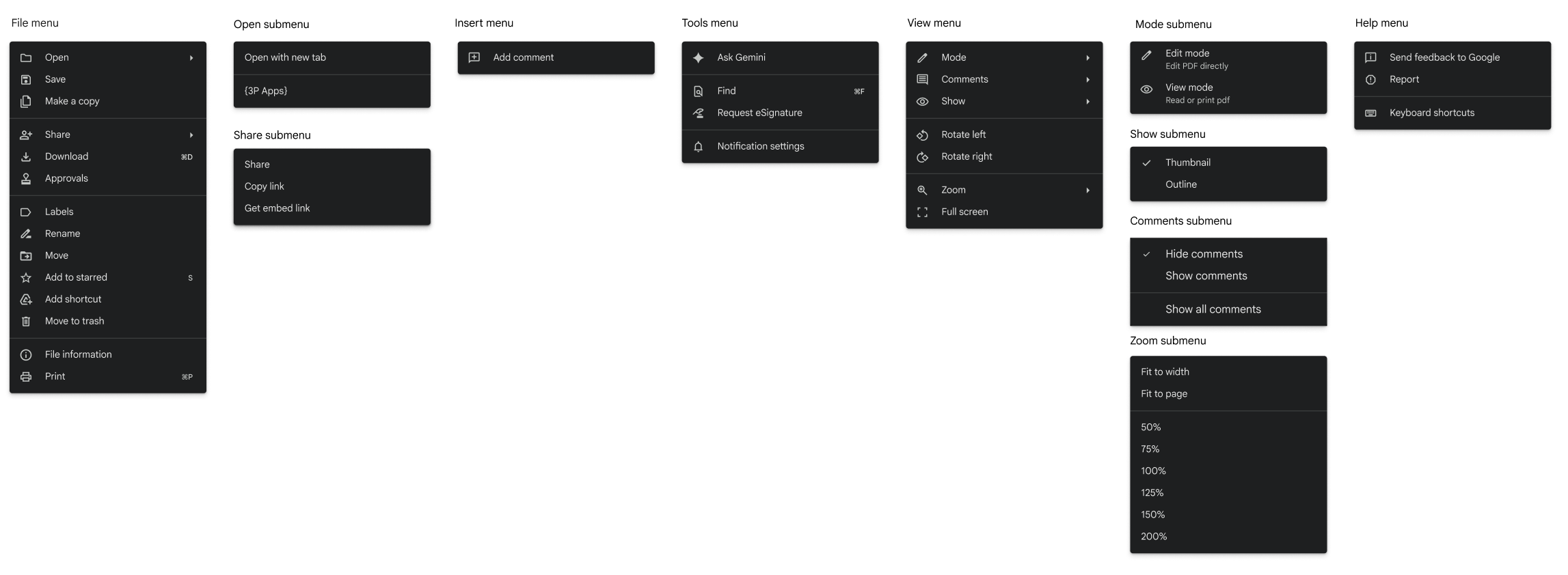
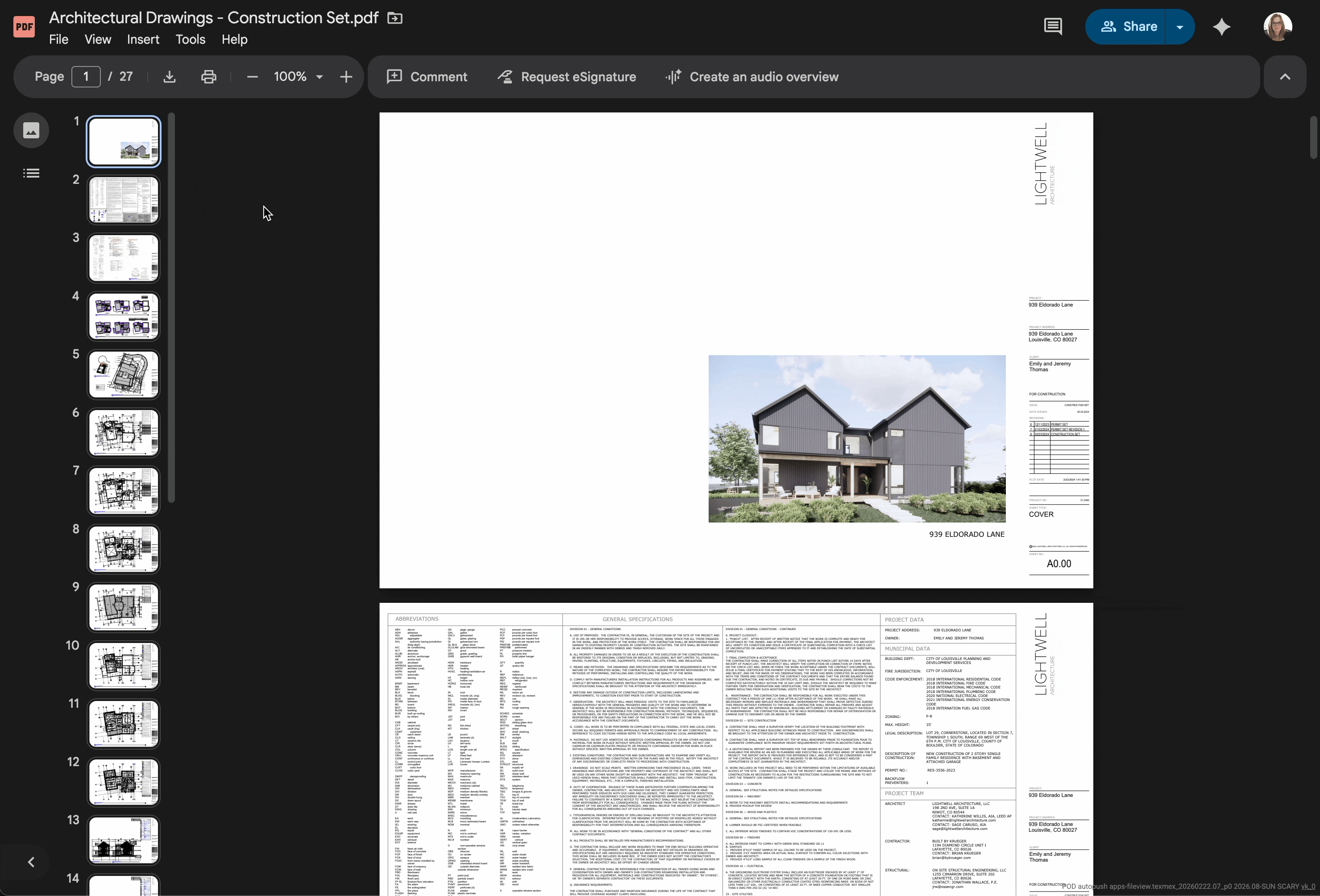
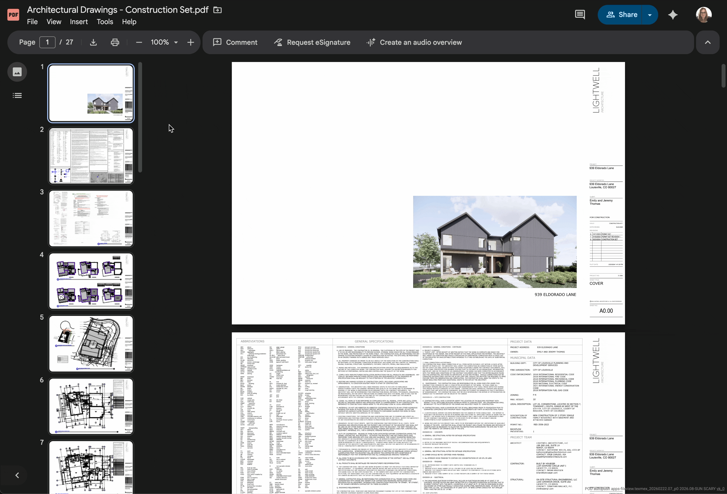
Table stake features
To deliver 12 features within an aggressive timeline, I prioritized familiar interaction patterns over custom components, aligning interactions with Workspace and Chrome conventions to reduce UX complexity and create cross-product consistency
- Two page view
- Grid view
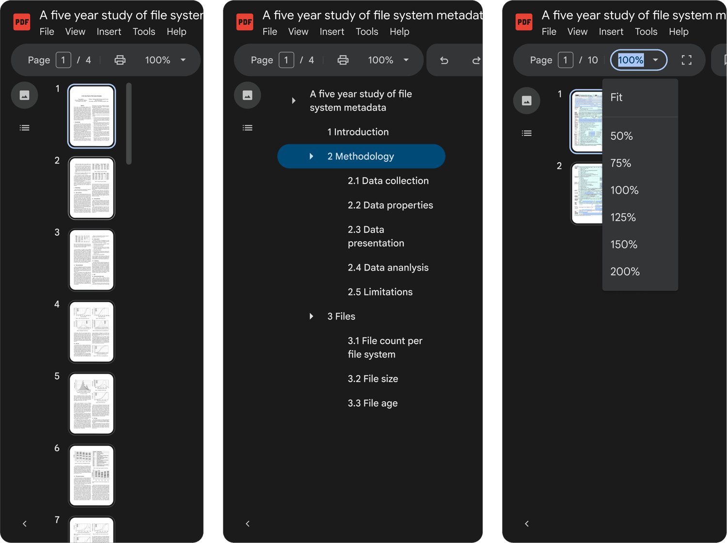
- Table of contents
- Thumbnail preview
- Zoom improvements
- Present mode
- Rotate pages
- Rearrange pages
- Join PDF
- Extract PDF
- Markup (text, shape, line, signature)
- Form filling
I led the definition and prototyping of end-to-end journeys in partnership with another designer, aligning cross-functional stakeholders and preparing the experience for usability testing.
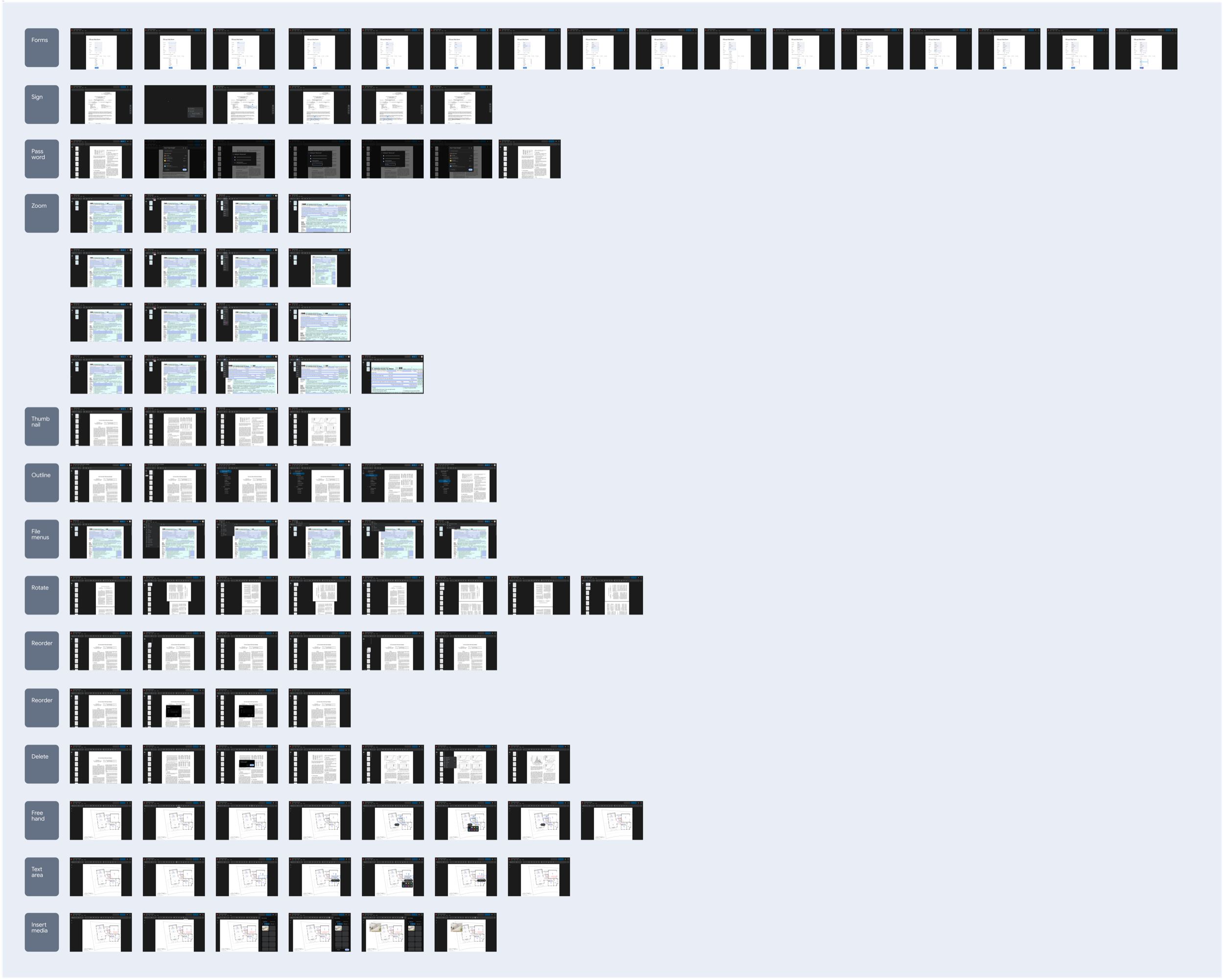
Created a prototype to evaluate core workflows, including opening, navigating, viewing, and editing PDFs.
100% task completion across all features, with the exception of saving a file.
The Save button was confusing. Users expected autosave behavior consistent with the rest of Google Workspace, and introducing a manual save action broke their mental model. Many participants assumed the button would create a copy rather than save changes.
When autosave proved technically infeasible, I iterated on the Save interaction to better communicate system behavior, balancing platform constraints with users' existing Workspace mental models.

At this point in the project, Engineering underestimated feature development time due to legacy platform limitations, so we had to reduce scope for MVP.
- Toolbar
- File menus
- Table of contents
- Thumbnail preview
- Zoom improvements
- Standard form filling
Final Designs
Landing metrics
Launched 6 features to close the competitive gap and established unified navigation framework across Drive's file view—impacts 1.7 billion weekly views.
- 20% increase in CSAT: 74%
- 7% decrease in DSAT: 12%
What I learned
Defining clear product principles helped the team move faster and make more consistent decisions. They provided a shared framework for evaluating tradeoffs and kept design and engineering aligned as we delivered a large set of foundational features.
This work reinforced that even when building standard capabilities, maintaining alignment across teams requires ongoing leadership and clarity of vision.